How a scene works
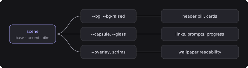
A scene is four inputs: a wallpaper, a base colour, an accent, and a dim strength. From those, src/styles/global.css mixes every other token with color-mix() — raised surfaces, the frosted nav capsule, glass panels, borders, text shades, the readability overlay and the edge scrims. Components only ever use the derived tokens, so a new scene is a config entry, not a stylesheet.
scenes: { default: 'matte', options: [ { id: 'matte', // stored in the visitor's localStorage — don't rename casually label: 'matte', // shown in the menu wallpaper: '/images/scenes/matte.webp', // or null for a flat colour scheme: 'dark', // 'light' flips text, glass and border tokens base: '#141416', // surface colour everything is mixed from accent: '#a8a3f7', // links, prompts, focus rings, reading bar dim: 0.32, // 0–1 overlay strength; busy wallpapers need more }, ],},The visitor’s choice is applied by a tiny inline script before first paint, so there is no flash of the wrong scene. Their wallpaper is preloaded; the others are warmed in the background after the page settles.
Making a wallpaper
Anything soft works: a blurred photo, a gradient, generated noise. Guidelines that held up:
- 1920 × 1080 WebP, under 60 KB. It sits behind a grain overlay, so heavy compression is invisible. The five included scenes are 5–10 KB each.
- Low contrast. Text is read on top of it. If a wallpaper is busy, raise
dimrather than fighting it. - Match
baseto the wallpaper’s dominant colour. The overlay, scrims and capsule are mixed frombase, and they read as part of the picture when the two agree.
One scene, no switcher
Ship a single entry in scenes.options and the header menu, the t shortcut and the one-time hint all disappear. features.sceneSwitcher: false does the same with several scenes configured (the default is used for everyone).
Light scenes
scheme: 'light' swaps the ink: text shades are mixed from base toward black, glass and borders darken, and the nav capsule lifts toward white like paper. Pick a darker accent for light scenes — the included sand uses #5b51d8 against #a8a3f7 for the dark ones — so links keep their contrast.
Adjusting the derived tokens
If you want to change how surfaces are mixed rather than what they are mixed from, the knobs are at the top of src/styles/global.css:
:root { --lift-1: 6%; /* raised surfaces: how much white over base */ --capsule-lift-a: 14%; /* nav capsule top edge */ --glass-alpha: 5.5%; /* frosted panels */ --border-alpha: 9%; --radius: 14px; /* … */}[data-scheme='light'] { /* the same knobs for light scenes */}Keep body text at 7:1 or better against base — the defaults are, and the overlay only makes the ground darker (or lighter) than base.
Fonts
Space Grotesk (variable, latin subset, ~22 KB) is self-hosted through Astro’s Fonts API and preloaded. It is configured in astro.config.ts:
fonts: [ { provider: fontProviders.local(), name: 'Space Grotesk', cssVariable: '--font-space-grotesk', fallbacks: ['ui-sans-serif', 'system-ui', 'sans-serif'], options: { variants: [{ src: ['./src/assets/fonts/space-grotesk-latin-wght-normal.woff2'], weight: '300 700' }], }, },],To swap it, drop another .woff2 into src/assets/fonts/, change src and name, and update --font-sans in global.css if you change cssVariable. Any Fontsource package ships the files. The mono face is the visitor’s system monospace stack.
Code blocks
Expressive Code uses a single dark theme (github-dark-default) so snippets read as frosted panels in every scene, light ones included. To follow the scene instead, edit the integration in astro.config.ts:
expressiveCode({ themes: ['github-dark-default', 'github-light'], themeCssSelector: (theme) => theme.type === 'dark' ? ':root:not([data-scheme="light"])' : '[data-scheme="light"]', // …}),and drop the dark --code-bg override from the [data-scheme='light'] block in global.css.
Effects
Reading progress, back-to-top, the edge scrims, the header tuck and the reveal-on-scroll are each a flag in features. All of them are CSS scroll-driven animations except the header, which uses a ten-line scroll listener; browsers without scroll timelines simply show everything in place, and prefers-reduced-motion turns the reveals off.